Showing posts with label Tutorials. Show all posts

Saturday, August 6, 2011

Simple Vector Character Tutorial

Suwe ora joget, joget karo mangan telo. Suwe ora update, update pisan moga2 ra gawe gelo.. Jawa maksain, he he... ^^;
Seperti yang telah dijanjikan sebelumnya, sekarang akan kita praktekan bagaimana cara mewarnai dengan live paint object di Illustrator.
Semoga yang ini lebih mudah dan simpel. Tutorial dimulai!

As promised before, we will now practice how to color with a live paint object in Illustrator. Hopefully this one is easier and simpler. Tutorial starts!

♦ Step 1
Kita mulai dengan File> place> pilih sket gambar kamu atau bisa juga langsung drag & drop dari explorer kamu ke Illustrator. Atur posisi, lock, dan buat new layer diatasnya.

We start with File> place> select your drawing sketch or you can also directly drag & drop from your explorer to Illustrator. Adjust the position, lock, and create a new layer above it.

 
♦ Step 2
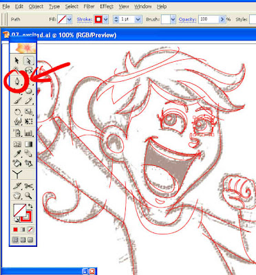
Saatnya ngetrace! Buat line2 mengikuti sket gambar dengan Pen Tool (P). FYI: Line tidak harus membentuk object (closed path), bisa dengan saling tumpuk atau bertabrakan dengan line yang lain (open path).

It's time to trace! Make line2 following the drawing sketch with the Pen Tool (P). FYI: Lines do not have to form objects (closed path), they can overlap or collide with other lines (open path).

 
♦ Step 3
Gini deh hasilnya. Sket bisa dihidden atau dibuang. Pastikan tidak ada sudut2 line gambar yang masih terbuka.

This is the result. Sketches can be hidden or thrown away. Make sure that there are no open image angles.

 
♦ Step 4
Kemudian select all, boleh digroup boleh tidak. Dan piih Live Paint Bucket Tool (K) untuk menimpa warna.

Then select all, may be grouped or not. And select the Live Paint Bucket Tool (K) to overwrite the color.

 
♦ Step 5
Warnailah sesuai selera kamu, bebas! Beri gelap terang dengan warna yang senada. dijamin, Sip!!

Color according to your taste, free! Give dark light with a matching color. guaranteed, Nice!!

 
♦ Step 6
Sudah puas? Sekarang pilih Selection Tool (V), kemudian pilih Stroke (X) dan tekan None (/), lalu Expand! TADAAAA!!!

Satisfied? Now select the Selection Tool (V), then select Stroke (X) and press None (/), then Expand! TADAAAA!!!

 
♦ Step 7
Tambahin sedikit pemanis, vector character sudah siap untuk diupload :)

Add a little sweetener, vector character is ready to upload :)

  Selalu berlatih dan terus berkarya!!

Always practice and keep on working!! 

Wassalam!
Share:

Sunday, March 20, 2011

Super Girl For Vector Stock

Yay! Ketemu lagi! ha ha..:D Kali ini kita akan belajar bersama kak KeMotaku membuat ilustrasi vector dengan Adobe Illustrator dengan tema Super Girl untuk keperluan vector stock. Tentu saja masih alakadarnya seperti biasa... Yah maklumlah, ilmu yang saya punya ga banyak2 amat.
Okeh, langsung kita mulai saja ya! Tutorial dimulai!

Yay! See you again! ha ha ..: D This time we will study together bro KeMotaku creates vector illustrations with Adobe Illustrator with the theme Super Girl for vector stock purposes. Of course it's still as common as usual ... Well you know, the knowledge I have is not very much.
Ok, let's start right away! Tutorial starts!

♦ Step 1
Pertama2 open new document dulu, kemudian import sket kamu. File> place> pilih sket yang mau kamu buat vectornya. Atur posisi dicanvas dan lock pada layer. Kemudian buat new layer diatasnya. Sip!

First open the new document first, then import your sketch. File> place> select the sketch you want to make the vector. Adjust position and lock on layer. Then create a new layer above it. OK!

Ntut01
♦ Step 2
Sekarang kita mulai trace (jiplak) sket tadi dilayer baru ini. FYI: Dalam project kali ini seperti yang kalian lihat pada gambar, saya membuat object per bagian2 (lihat tanda panah merah). Dengan satu tujuan agar nanti memudahkan kita untuk mengradasi warna sesuai arah cahaya yang diinginkan. Yah... kira2 begitulah ha ha... :D

Now we begin to trace the sketch this new layer. FYI: In this project, as you can see in the picture, I made objects per section (see the red arrow). With one goal that will make it easier for us to direct the color according to the desired direction of light. Well ... that's about it ha ha ...: D

Ntut02
Ntut03
♦ Step 3
Nah, begini nih hasilnya setelah diberi gradasi warna. Tanda panah adalah arah gradasi dari warna terang ke gelap. FYI: Default gradasi warna di Illustrator adalah hitam ke putih. Jadi pilih warna sesuai kebutuhan aja. Bisa juga disimpan dipalet warna dengan mengklik tombol new swacth (lihat lingkaran merah).

Well, here's the results after being given a color gradation. The arrow is the direction of gradation from light to dark colors. FYI: The default color gradation in Illustrator is black to white. So choose the color according to your needs. Can also be saved in the color palette by clicking the new swacth button (see red circle).

Ntut04
Ntut05
♦ Step 4
Saatnya menambah detail dengan membuat shadow.Lihat seperti pada contoh. Pada kasus ini, kita akan buat shadow pada bagian dada dan sekitar pinggul. Tidak perlu presisi pada bagian tepi object, yang terpenting area badan yang akan diberi shadow.

It's time to add detail by making shadow. Look like in the example. In this case, we will make shadows on the chest and around the hips. No need to be precise on the edges of objects, the most important area of ​​the body to be shadowed.

Ntut06
♦ Step 5
Kemudian klik object badan, lalu tekan ctrl+c kemudian ctrl+f. Itu adalah shortcut untuk mengcopy object kemudian menggandakan object tepat diatas object tersebut.

Then click the body object, then press ctrl+c then ctrl+f. That is a shortcut to copy an object and then copy the object directly above the object.

Ntut07
♦ Step 6
Klik copian object badan tadi, sembari menekan shift tekan object shadow. Kemudian tekan intersect pada pathfinder kemudian expand (lihat lingkaran). Bisa juga langsung tekan alt+klik pada tombol intersect.

Click copy body object earlier, while pressing shift, press object shadow. Then press intersect on the pathfinder then expand (see circle). You can also directly press alt+click on the intersect button.

Ntut08
♦ Step 7
Setelah itu pilih gradasi warna yang lebih gelap dan gradasikan sesuai arah panah dari terang ke gelap. Untuk mengatur posisi object supaya tidak menutupi object yang lain, tekan ctrl+[ sampai posisi object tepat di atas object badan. Bisa juga klik object>arrange> send backward.

After that choose a darker color gradation and gradate in the direction of the arrow from light to dark. To adjust the position of an object so as not to cover other objects, press ctrl + [until the object's position is directly above the body object. You can also click object> arrange> send backward.

Ntut09
♦ Step 8
Ulangi membuat shadow seperti step2 sebelumnya adn gradasikan sesuai arah panah :) FYI: Sebenarnya bisa juga mengkombinasi dengan blending dan transparasi pada object shadow, tapi karena ini untuk keperluan vector stock, jadi semua object tidak boleh diberi efek apapun. Semuanya harus normal tanpa efek, blending dan transparasi. Agar tidak terjadi masalah saat di save ke format eps8.

Repeat making shadows like the previous steps and then move them according to the direction of the arrow :) FYI: Actually it can also combine with blending and transparency of the shadow object, but because this is for vector stock purposes, so all objects should not be given any effect. Everything must be normal without effects, blending and transparency. So that there are no problems when saved to eps8 format.

Ntut10
Ntut11
♦ Step 9
Sekarang waktunya memberi highlight. Buat object highlight dan gradasikan ke warna yang lebih terang dan mengkilat (karena ini kostum superhero).

Now it's time to highlight. Create the highlight object and gradate it into a brighter and shiny color (because this is a superhero costume).

Ntut12
♦ Step 10
Ulangi step2 seperti membuat shadow bila diperlukan. Jangan bosen2 ya, karena memang dibutuhkan kesabaran dan ketelitian :)

Repeat the steps like making shadows when needed. Don't be bored, because patience and accuracy are needed :)

Ntut13
♦ Step 11
Tambahkan sedikit pemanis sebagai background dan...

Add a little sweetener as background and ...

Ntut14
Voila! Vector stock siap dihidangkan! :D

Voila! Vector stock is ready to be served! : D

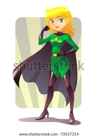
Super Girl
Sebelum diupload, pastikan dan cek lagi bahwa tidak ada open path dan stray object yang tertinggal. Sebenarnya ada cara lain untuk mewarnai dengan live paint object di Illustrator. Kita akan coba praktekan dilain kesempatan, ok!

Before uploading, make sure and check again that there are no open paths and stray objects left behind. There are actually other ways to color with a live paint object in Illustrator. We will try to practice the other time, ok!

Wassalam :)
Share:

Wednesday, July 15, 2009

How to Make a Book

Yah...kali ini iseng aja, daripada ngga ngupload sama sekali he he... Kebetulan ini aku ambil dari bahan presentasi buat anak2 SMA kemaren. Simpel aja sih materinya, yang penting mengenalkan ke mereka aja supaya tahu gimana sih proses dalam membuat buku itu.
Sambutan mereka cukup baik. Banyak yang malu2 buat nanya, apalagi ditanya... Baru deh pas acara selesai, mereka pada tanya2 soal ini-itu...dasar anak SMA...apaan sih yang mereka takuti...apa aku keseremen yak?? Te...hee...dulu aku juga gitu ding... (~_~)">
Yah...kira2 ya seperti inilah gambarannya...


Well ewel...semoga bisa sedikit membuka wawasan kita :D Practice Make Perfect!
Share:

Friday, June 19, 2009

How to Make a Gif Animation

Well...ewel...ewel...berbuhung bang Ino minta dibuatin tutorial lagi...dan saya juga belum prepare macem-macem, ya sudah seadanya saja dulu yak he he he... (~_~)">
Sebenernya ini tutorial buatan lama...cuman blom dishare aja ama temen-temen. Tak cari-cari dikompiku ngga ketemu juga...mungkin dah tak bakar trus tak hapus. Tapi alhamdulillah, di folder sent emailku masih ada ternyata...fiuuhh... Dulu sih niatnya cuman mbuatin tutorial buat temenku aja...masih malu-malu kalo mo dipublish kaya gini... Pake basa inggris segala...pokoknya amburadul bahasanya... (~_~)">
Well...sekali lagi, karena ini ada yang minta tutorial lagi...

Actually this is an old tutorial ... just not shared it with my friends yet. I've looking around on my pc, but couldn't find it either ... maybe I've burned to cd then delete it. But thanks God, turns out it's still in my email sent folder there ... fiuuhh ... In the past, the intention was to just make a tutorial for my friend ... still shy if want to published like this ... Using all English basics ... just messy the language ...
Well ... once again, because of this, someone asked for more tutorials ...


Karena tutorialnya lumayan panjang, silakan langsung sedot saja disini:

Because the tutorial is quite long, please just get it in here:

Gif Animation Tutorial by KeMot

Filenya dalam satu paket rar. Ada file mentahnya juga. Silakan kalo mo di obrak-abrik ato di modif, terserah kalian sajalah... (~_~)">

The file is in a rar package. There are raw files too. Please if you ransack or modif, it's up to you guys ...

Semoga tutorial kali ini dapat berguna juga :D Practice Make Perfect!
Share:

Tuesday, June 2, 2009

Menggambar CHIMO

Alhamdulillah udah 100 hits. Sebagai ungkapan syukur, mari kita menggambar Chimo sembari berbagi tutorial.
Chimo, apa itu Chimo? Asal ngarang aja aku he he he...
Yang jelas Chimo kependekan dari C, H, I, M, O ... Yup, disingkat jadi Chimo...
Halah!!!
Untuk lebih jelasnya, kita bahas lain kali sajah!
Sekarang waktunya tutorial menggambar Chimo dengan Software SAI.
Apa itu SAI?? SAI adalah S, A, I, jadi...
Sudahlah...
SAI adalah software paint tool dari Systemax. Jelas lebih ringan dari Photoshop dan juga mudah digunakan. Coba dulu deh, baru komentar!
Downloadnya disini nih http://www.systemax.jp/en/sai/ > Trial 31 hari.
Kalo mo nyari yang full cracked, tanya mbah Google aja.
Sayangnya, punyaku masih trial and error... Gak bisa buat disave *.sai ato *.psd.
Jadinya langsung tak jpg aja... Damn! Abis ini tak uninstall! Trus googling lagi deh he he...

Sebelum mulai... pakailah WACOM guys. Sangat saya sarankan itu.
Beli pake duit sendiri jauh lebih oke. Minta ortu juga boleh...
Nekat pake mouse optik ato yang biasa?? Salut buat kamu... Two Thumbs Up!!

Ya udah. Langsung aja kita mulai tutorialnya!! \(^ o ^)/

Now it's time to draw a Chimo tutorial with SAI Software.
SAI is a paint tool software from Systemax. Definitely lighter than Photoshop and also easy to use.
Alright. Let's start begin the tutorial!!

♦ Step 1
Buka SAI, trus bikin kanvas baru. Terserah mo ukuran berapa, yang penting sreg aja. Karena lagi pengen nggambar cepet dan ringan, aku cuman pake resolusi 72dpi dengan ukuran 362x512 pixel.

Open SAI, then make a new canvas. The size is up to you, the important thing is suited to you. Because I want to draw quickly and lightly, I only use 72dpi resolution with a size of 362x512 pixels.

♦ Step 2
Langsung deh warnai tu kanvas pake warna yang kamu suka. Bisa pake brush ato langsung pake bucket. Kenapa diwarna kanvasnya? Suka-suka akulah... Biar dapet color mood aja... jadi pemacu buat nggambar :P

Immediately color the canvas using the color you like. Can use brush or use bucket directly. Why is the canvas colored? Because I like it... To get the color mood ... for drawing booster :P

♦ Step 3
Sekarang waktunya bikin sket Chimo. Buat garis panduan untuk coloring aja. Ntar juga garisnya ditimpa pake warna. Jadi ga usah rapi-rapi amat, yang penting bentuknya kliatan.
Seperti yang telah kubilang dari awal, ini nggambar cepet dan ringan. Jadi cuman pake 1 layer aja, ga usah kemaruk...

Now it's time to make a Chimo sketch. Draw a guide for coloring. Later the lines are overwritten using colors. So you don't need to tidy up, the important thing is the form looks.
As I said from the beginning, it was fast and light. So, just use one layer, you don't need to get greedy...

♦ Step 4
Okai, langsung timpa warna aja. Pokoknya kasih warna dasar dulu, blepotan juga gak pa pa. Oya nih, disini aku pake crayon brush. Nyoba-nyoba aja sih... orang ini juga pertama kalinya pake SAI kok we he he he...

Okay, just override the color. Just give a basic color first, not tidy is fine too. Anyway, here I use crayon brush. Just try it ... This is my first time using SAI too we he he he...

♦ Step 5
Sipp, waktunya brushing and shading. Jangan tanya masalah lighting deh... Aku juga masih belajar, perlu banyak latihan dalam masalah kayak gini. Harus banyak observasi biar bisa dapet feel-nya...suerrr!!
Kalo masalah brush, aku pake default darisononya. Mo kamu atur size ma opacitynya juga boleh, yang penting sreg ajah!

Great, it's time for brushing and shading. Don't ask the lighting problem ... I'm also still learning, I need a lot of practice in this kind of problem. Must have a lot of observations so I can get the feel...true!!
When it comes to brushes, I use the default ratio. You can set the size and opacity too, which is suited you!

♦ Step 6
Udah nyadingnya?? Beneran dah mantep? Ya wes, tinggal ditambahin detil ma highlight.
Si Chimo tak kasih rona-rona merah di pipi biar tambah imoet kayak aku... Hoeekkk...
~(* o *)~

Shading already?? Is it really good? If yes, all that's left is to add ma highlight details.
Give Chimo some blush on the cheeks so it'll look cute as me ... Hoeekkk ...

♦ Step 7
Tidak lupa menggosok gi... eh... memberi brand name pada hoody si Chimo.
Biar hoody-nya gak kliatan plain aja...

Don't forget to rub your teet ... uh ... give the Chimo hoody the brand name.
So the hoody doesn't looks plain ...

♦ Step 8
Yosh! Lanjut ke bagian-bagian yang laen juga. Yang kudu di ingat adalah; shading yang bener dulu, trus baru deh kasih detil-detil dan highlight pada si Chimo.
Cari warna-warna yang senada aja buat shading, kecuali kalo kamu pengen yang lebih ekstrim ma kasih backlight segala, baru deh pilih warna sesukamu yang penting bisa ngeblend!

Yosh! Continue to other parts too. What must be remembered is; first shading right, then just give details and highlights to the Chimo.
Look for colors that are just the same for shading, except if you want to be more extreme, I'll give you backlight, then just choose the color as you like, the important thing is to blend!

♦ Step 9
Sipp. Si Chimo udah beres nih. Kalo berasa kurang, tinggal di adjust warnanya aja.
Tinggal nambahin mark or logo yang khas dari kamu.
Violla! Upload deh di blog kamu dan tunggu caci makian yang udah menunggu dari tadi...
(-_-)V

Nice. The Chimo is done. If it doesn't taste, just adjust the colors.
Just add the mark or logo that is unique to you.
Violla! Upload it to your blog and wait for the curse that you've been waiting for earlier...


Guys, kalo mo download tutorialnya dalam bentuk PDF silakan sedot disini nih:

Guys, if you want to download the tutorial in PDF format, please get it here:

SAI Tutorial by KeMot

Semoga tutorial ini dapat membantu dan memacu semangat kita untuk terus berkarya!

Hopefully this tutorial can help and spur our enthusiasm to continue working!

Practice Make Perfect!
Share: